
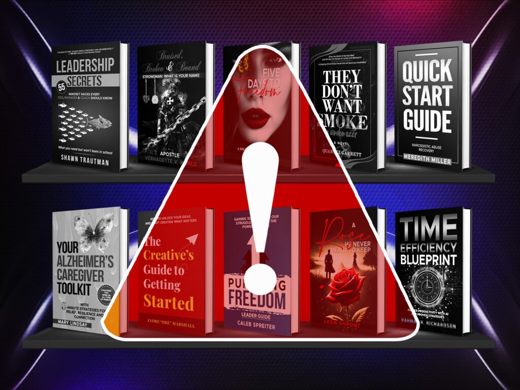
Most self-published authors spend months writing their book but only days thinking about the cover. That imbalance is costly. On Amazon KDP, your cover is your most powerful marketing tool — and getting it wrong means readers scroll straight past you before reading a single word.
Here are the 5 most common book cover mistakes self-published authors make and exactly how to avoid them.
Mistake 1 — Ignoring Genre Conventions
Every genre has a visual language that readers instantly recognise. Fantasy covers use dramatic lighting, epic landscapes and bold typography. Romance covers feature warm tones, intimate imagery and elegant fonts. Thriller covers go dark, high contrast and sharp.
When your cover doesn’t match these conventions readers subconsciously feel something is off — even if they can’t explain why — and they move on.
The fix: Before designing your cover browse the top 20 bestsellers in your specific genre on Amazon. Note the color palettes, typography styles and imagery. Your cover should feel like it belongs on that shelf while still standing out from it.
Mistake 2 — Designing for Print Without Thinking About Thumbnails
Most authors design their cover thinking about how it looks as a full sized image. But on Amazon KDP the majority of readers discover books on mobile devices where your cover displays at roughly 200px wide — about the size of a postage stamp.
At that size, complex backgrounds become muddy, thin fonts become unreadable and intricate details disappear completely.
The fix: Always test your cover at thumbnail size before finalising. If the title isn’t readable and the mood isn’t clear at 200px — it needs to be simplified.
Mistake 3 — Using Generic Stock Photos
Nothing signals amateur more reliably than a cover built from an obviously generic stock photo. Readers have seen the same images across dozens of books and instantly recognise them.
A generic stock photo tells readers you didn’t invest in your book. And if you didn’t invest in it — why should they?
The fix: Work with a designer who either uses premium licensed imagery, custom illustrations, or uniquely composited elements that create something original and specific to your book.
Mistake 4 — Choosing the Wrong Typography
Typography is responsible for more failed book covers than almost any other element. Common mistakes include:
- Using decorative fonts that are beautiful up close but unreadable at thumbnail size
- Choosing fonts that don’t match the genre tone
- Making the author name larger than the title
- Using too many different fonts on one cover
The fix: Your title should be the dominant typographic element, clearly readable at thumbnail size, and matched to your genre’s visual conventions. When in doubt — simpler is almost always better.
Mistake 5 — Treating the Cover as the Last Step
Many authors finish writing, rush through editing, then treat the cover as a quick final checkbox before publishing. This backwards approach almost always produces underwhelming results.
Your cover brief should be as detailed as your manuscript outline. The more clearly you communicate your vision, genre, target audience and comparable covers — the better your designer can create something that genuinely sells.
The fix: Start thinking about your cover during the editing phase. Research comparable covers, collect references, and brief your designer properly. A well briefed designer produces better work faster with fewer revisions.
Final Thought
Every one of these mistakes is avoidable. The authors who succeed on Amazon KDP aren’t necessarily the best writers — they’re the ones who treat their book as a product and their cover as its most important marketing asset.
A professional book cover designer who understands your genre, your audience and your vision eliminates all five of these mistakes before they happen. Explore our book cover design services and let’s make sure your cover works as hard as your writing does.